RISK FACTOR
Boosting Data Visibility & Engagement
Risk Factor is your go-to online tool for searching any property and discovering its environmental risks, such as flooding, wildfire, wind, or extreme heat. Built with some of the world’s most complex and advanced climate data, Risk Factor provides invaluable insights for homeowners, sellers, and real estate agents making tough life decisions. Here’s how we updated the entire website experience to ensure users can easily find the data they need while also increasing subscription rates.
Identifying Issues and Designing Solutions
Fueling Creativity and Innovation in Just One Week
We started the ideation phase with a week-long design sprint, focusing on customer feedback and insights from interviews. The team collaborated to brainstorm innovative ideas and set a clear direction, keeping our customers’ perspectives central.
Sketches
Concept Development
Mid-Fidelity Sketches
Iterating
Exploring Solutions for an Enhanced User Experience
Sketching and exploring solutions at a mid-fidelity level really helped our team get a clear sense of the direction we wanted to take. This hands-on approach allowed us to visualize our ideas, tweak them on the fly, and ensure everyone was on the same page before moving forward. It was a fun and collaborative way to shape our vision.


Redefining & Designing
User-Centric
Adaptive Layout
Performance Optimization
Intuitive Navigation
Listening to Users: Interviews Lead to Accordion Design as the Solution
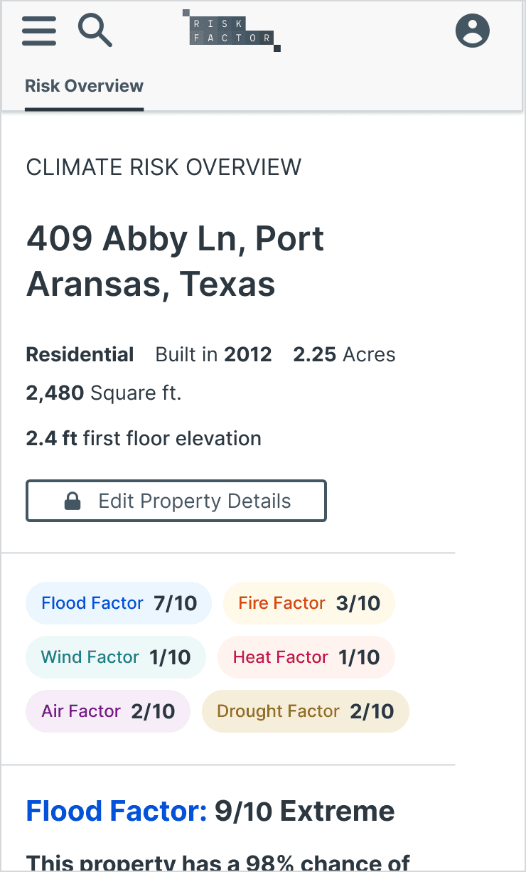
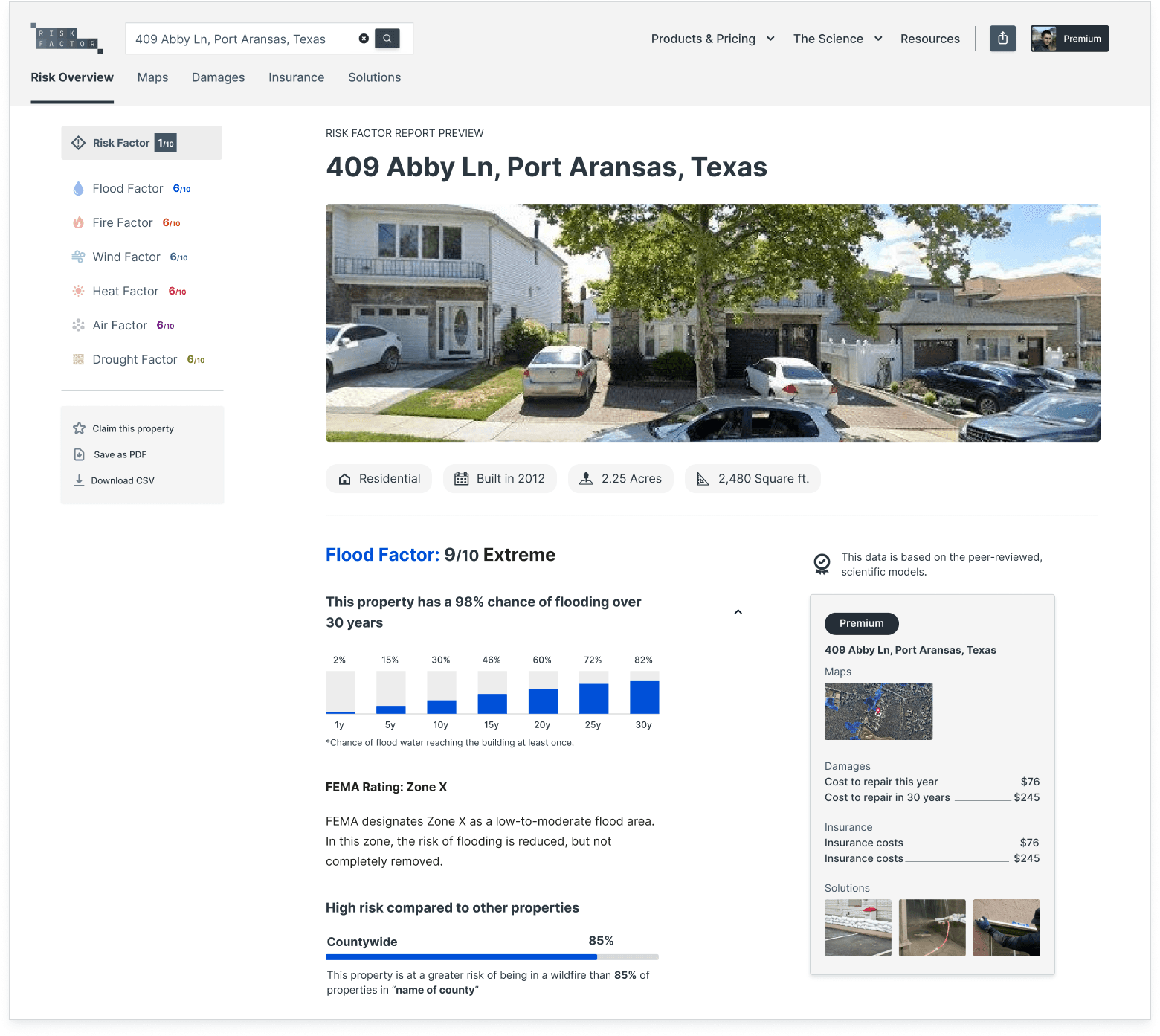
We made sure to really listen to our users and understand their needs through interviews and surveys. By blending their feedback with thorough market analysis, we placed their voices at the heart of our product development. This guided every step we took, making the process more meaningful and effective. Using an accordion design, we streamlined the experience, reducing 16 pages per property to a single page with all climate perils.
Property Overview
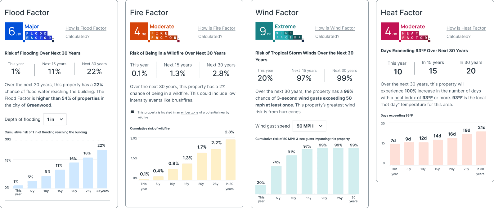
Each property includes an overview of every climate peril.
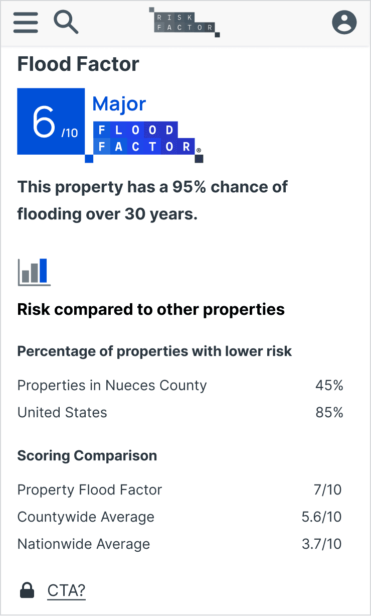
Climate Maps
We designed a way for the user to take advantage of our property data with a very easy way to navigate to the maps experience.

Climate Maps
We designed a way for the user to take advantage of our property data with a very easy way to navigate to the maps experience.

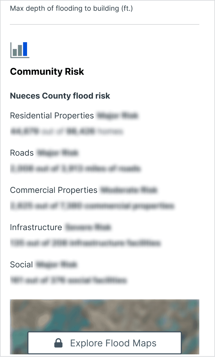
Data Simplification
Data Visualization
Data Simplification
Adaptive Design
Complex Data Streamlined into Smart Components
We transformed complex damage data into an expandable component, allowing users to view detailed information effortlessly. This component presents comprehensive climate damage data and lets users modify property details to adjust the calculations. Additionally, it forecasts climate impacts for today, 15 years, and 30 years into the future. This user-friendly design ensures that users can interact with and understand the evolving impact of climate perils on their property dynamically and accessibly.
Climate Damage Forecast: Collapsed
Giving the users the ability to calculate their properties damage today, in 15 years and in 30 years.

Climate Damage Forecast: Expanded
By using collapsible containers and horizontal scrolling tables, we enabled users to view all peril-specific damage data on a single screen.