RISK FACTOR
Boosting Data Visibility & Engagement.
Risk Factor is your go-to online tool for searching any property and discovering its environmental risks, such as flooding, wildfire, wind, or extreme heat. Built with some of the world’s most complex and advanced climate data, Risk Factor provides invaluable insights for homeowners, sellers, and real estate agents making tough life decisions. Here’s how we updated the entire website experience to ensure users can easily find the data they need while also increasing subscription rates.
Identifying Issues and Designing Solutions
Problem
Risk Factor faced challenges with its property page experience. Users struggled to locate and understand necessary information, leading to a noticeable drop in engagement. Navigating between property details pages and the map experience was difficult, and each property search spanned across 16 pages, making it essential for users to access and grasp all details about their address search effortlessly. One stipulation for the redesign was staying within the previous site’s framework, which presented a fun challenge.
Solution
Modernize the platform to align with existing real estate products and improve product usability and user adaptation. Consolidate pages to make complex data more digestible for users, as each property had 16 individual pages of data. Simplify the complexity of the data to help users better understand how climate risk impacts their property. Incorporate premium content with calls-to-action for free trials to incentivize users to subscribe.
Fueling Creativity and Innovation in Just One Week
We started the ideation phase with a week-long design sprint, focusing on customer feedback and insights from interviews. The team collaborated to brainstorm innovative ideas and set a clear direction, keeping our customers’ perspectives central.
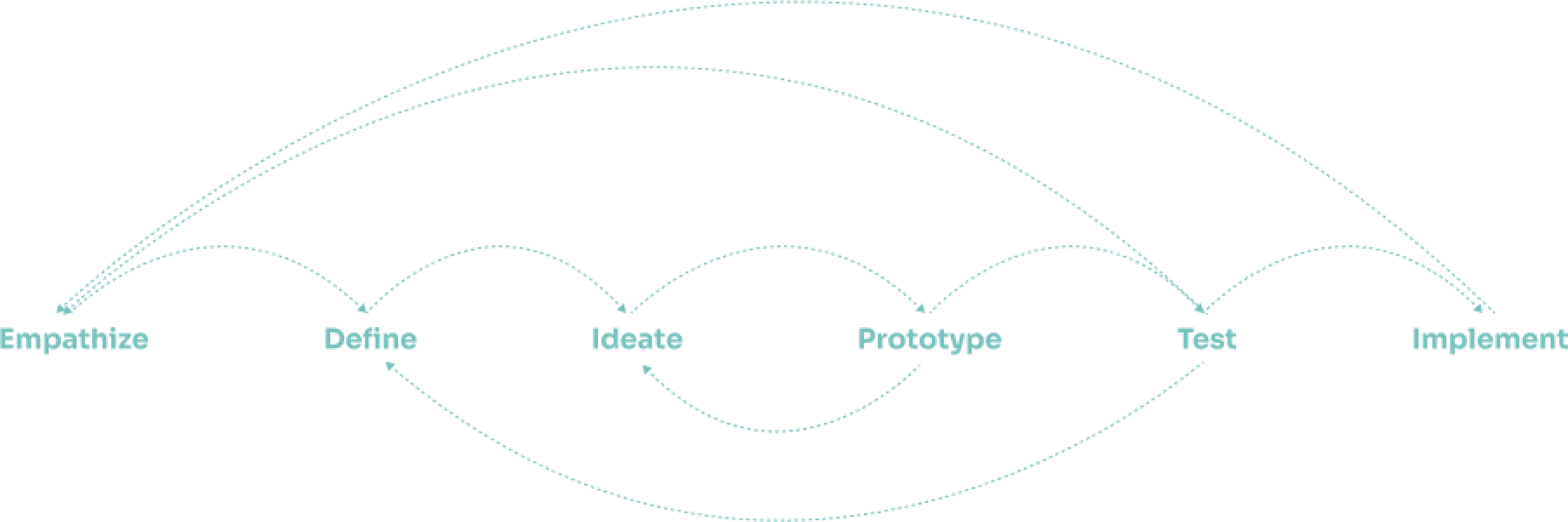
Sketches
Concept Development
Mid-Fidelity Sketches
Iterating
Exploring Solutions for an Enhanced User Experience
Sketching and exploring solutions at a mid-fidelity level really helped our team get a clear sense of the direction we wanted to take. This hands-on approach allowed us to visualize our ideas, tweak them on the fly, and ensure everyone was on the same page before moving forward. It was a fun and collaborative way to shape our vision.
Listening to Users
User-Centric
Adaptive Layout
Performance Optimization
Intuitive Navigation
Interviews Lead to Accordion Design as the Solution
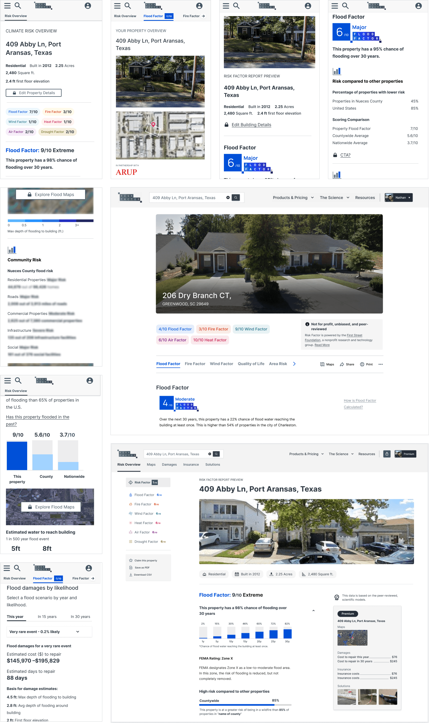
We made sure to really listen to our users and understand their needs through interviews and surveys. By blending their feedback with thorough market analysis, we placed their voices at the heart of our product development. This guided every step we took, making the process more meaningful and effective. Using an accordion design, we streamlined the experience, reducing 16 pages per property to a single page with all climate perils.
Property Overview
Each property includes an overview of every climate peril.
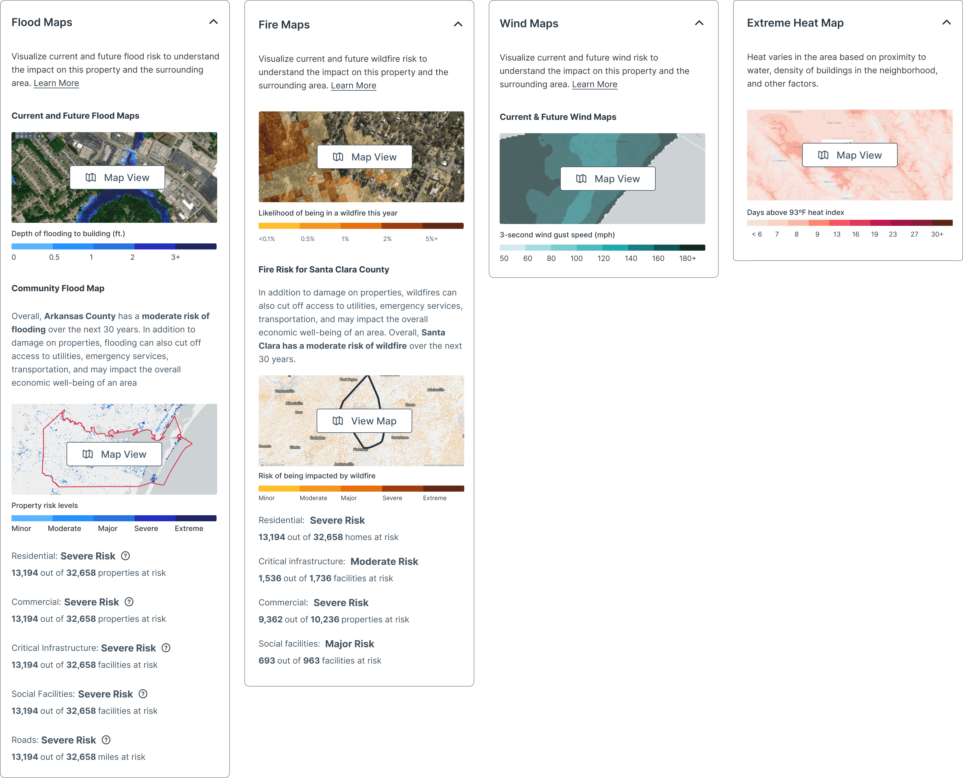
Climate Maps
We designed a way for the user to take advantage of our property data with a very easy way to navigate to the maps experience.
Data Simplification
Data Visualization
Data Simplification
Adaptive Design
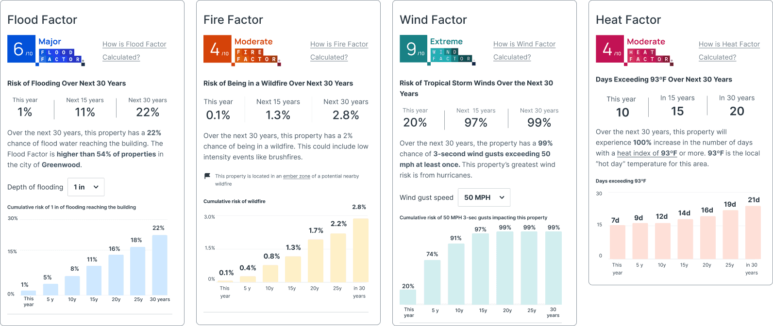
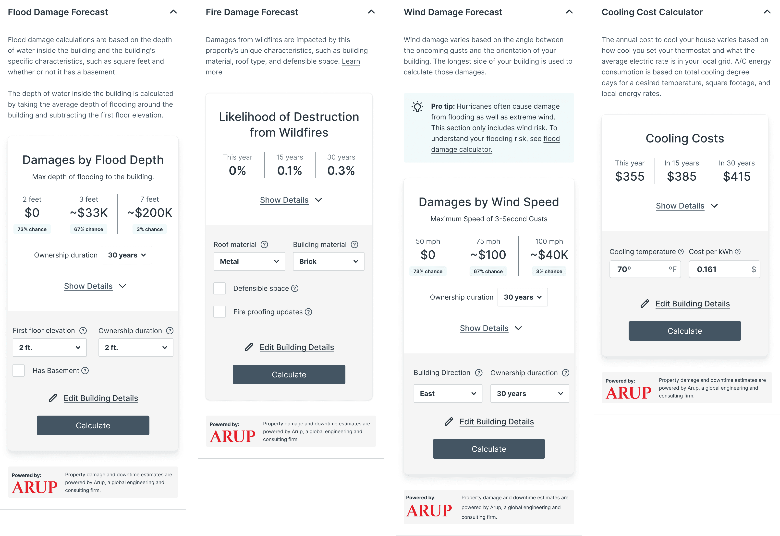
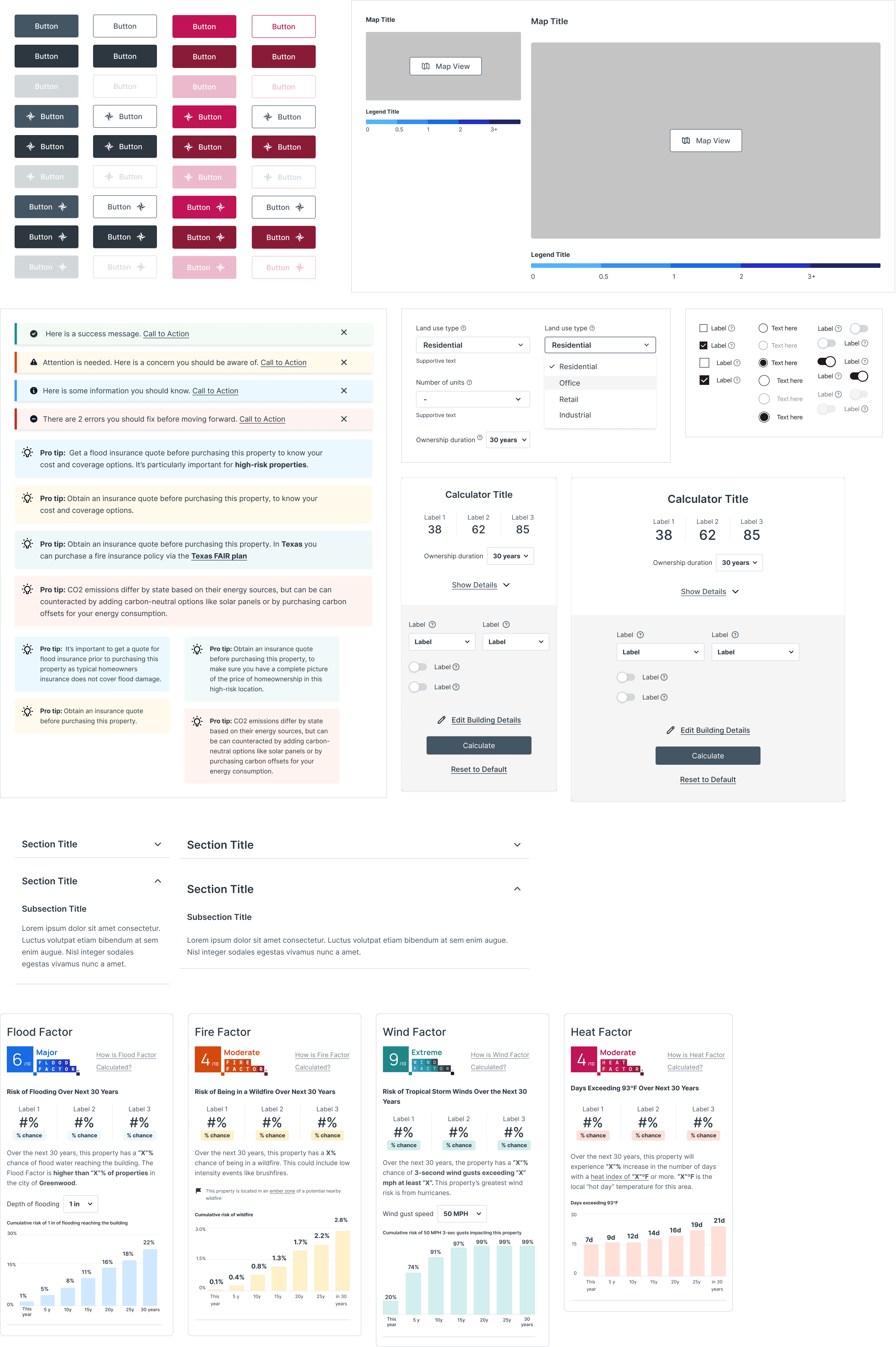
Complex Data Streamlined into Smart Components
Property Damage Forecast: Collapsed
Allowing users to view estimated property damage caused by climate and alter building details to adjust the damage calculations.
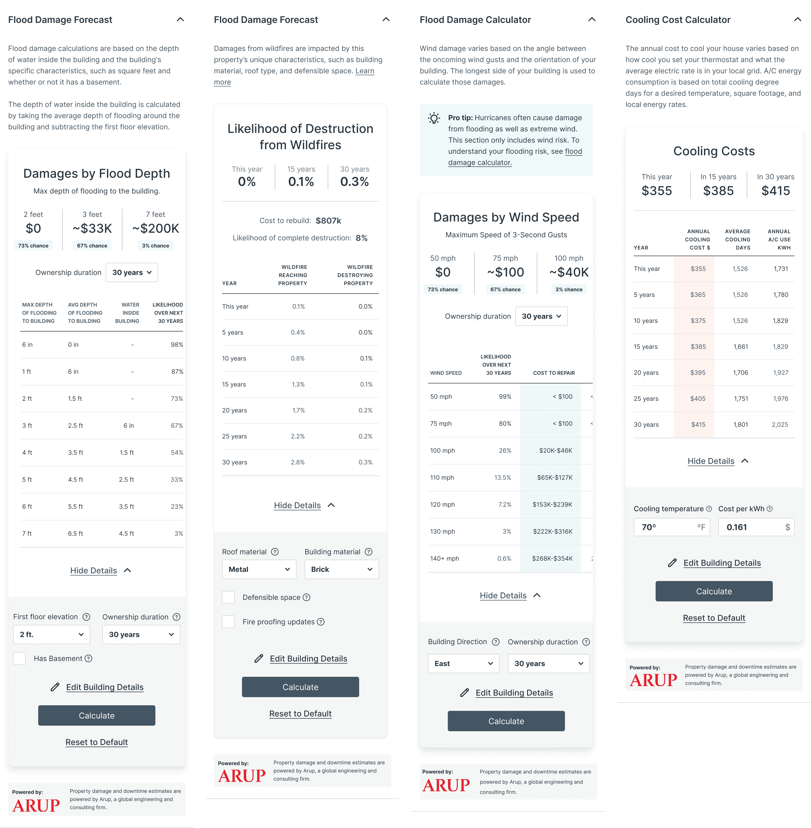
Property Damage Forecast: Expanded
Each property includes an overview of every climate peril.
Boosting Subscriptions
Conversion
Incentives
Engagement
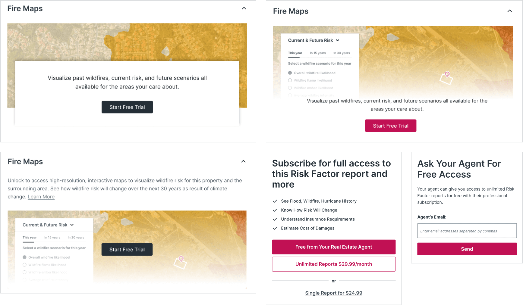
Using Premium Content to Bring in Users
We’ve enhanced our subscription package with advanced tools and detailed stats, making it even more valuable for users. Plus, we’ve added a “Share with Your Agent” feature, allowing users to request access to premium content from their real estate agents. This premium content enriches their experience and makes subscribing more appealing, offering access to unique insights and resources.
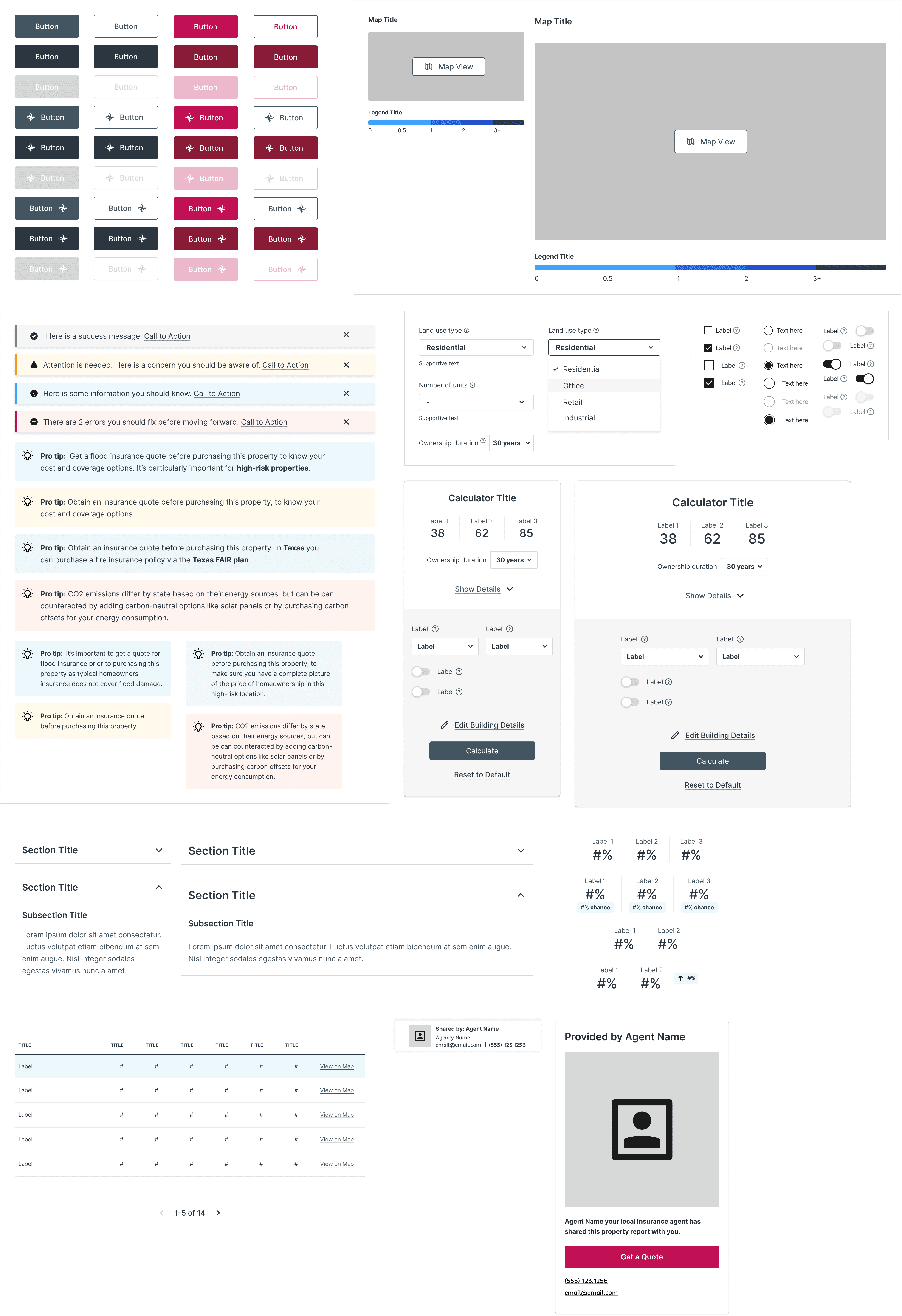
Designing for Scale
Data Visualization
Data Simplification
Adaptive Design
Elevating Our Design System for Enhanced Property Details
Celebrating Success
Data Visualization
Data Simplification
Adaptive Design
Reaching Goals Through Enhanced Product Features
Consolidating the property experience, simplifying complex data, and building premium content into the flow turned the property details page into a growth driver. The redesign lifted engagement and free trial sign-ups and grew monthly subscription revenue from $1K to $35K.
13%
Increased time on site
217%
Increase in free trial sign ups
2K
Agent email requests were sent
Learnings
Retrospective
System Pain Points
Framework Redesign
Hindsight Insights on Adjustments We Could Have Made
It’s always tempting to consider “what if” when reflecting on a project, but given the rapid turnaround time, it’s challenging to pinpoint specific missteps. However, if we were to approach this project again, allocating more time upfront to rethink and redesign the site framework and templates would likely be beneficial. Working within the constraints of an outdated design structure proved challenging, particularly when trying to simplify complex data using an existing design system. Addressing these issues earlier could have alleviated some of the pain points encountered during the layout process.